A beautiful site is no longer a “nice to have” for modern brands—it’s a business asset. Your website is often the first interaction someone has with your company, and in a matter of seconds it communicates trust, professionalism, and relevance (or the lack of it). For beginners, building a great-looking site can feel daunting, especially with limited design experience or technical resources. The good news is that creating a visually polished, brand-aligned site is less about design talent and more about making smart, intentional choices. Here are seven practical tips to help beginners build a beautiful site that works for their brand and their business goals.
1. Start With Brand Clarity Before Design
Before thinking about layouts, colors, or fonts, get clear on your brand. A beautiful site is one that fits your business, not just one that follows design trends. Ask yourself what your brand stands for, who your audience is, and what emotions you want your site to evoke. A B2B industrial company should feel very different from a creative agency or consumer brand. When brand clarity comes first, design decisions become easier and more consistent. You’re no longer guessing—you’re expressing.
2. Simplicity Is the Most Underrated Design Skill
Beginner websites often try to do too much at once. Too many colors, too many fonts, too many sections competing for attention. Simplicity is what makes a site feel refined. Choose a limited color palette, stick to one or two fonts, and let space work for you. White space (or negative space) isn’t empty—it’s what allows content to breathe and feel intentional. Simpler sites load faster, communicate more clearly, and age better over time.
3. Design for Flow, Not Pages
Beautiful websites guide visitors naturally from one point to the next. Instead of thinking in terms of “pages,” think in terms of flow. What should someone understand first? What action should follow? Clear hierarchy—headlines, subheads, calls to action—creates rhythm and direction. Visual cues like alignment, contrast, and spacing help users move confidently through your site without feeling lost. When flow feels intuitive, beauty feels effortless.
4. Use Visuals That Reinforce Credibility
Images and graphics do a lot of heavy lifting in how a site is perceived. High-quality visuals instantly elevate your brand, while generic or mismatched images do the opposite. Choose visuals that reflect your real business, your customers, and your environment whenever possible. Authentic photography, subtle illustrations, and consistent icon styles all contribute to a cohesive look. The goal isn’t decoration—it’s reinforcement. Every visual element should support trust and clarity.
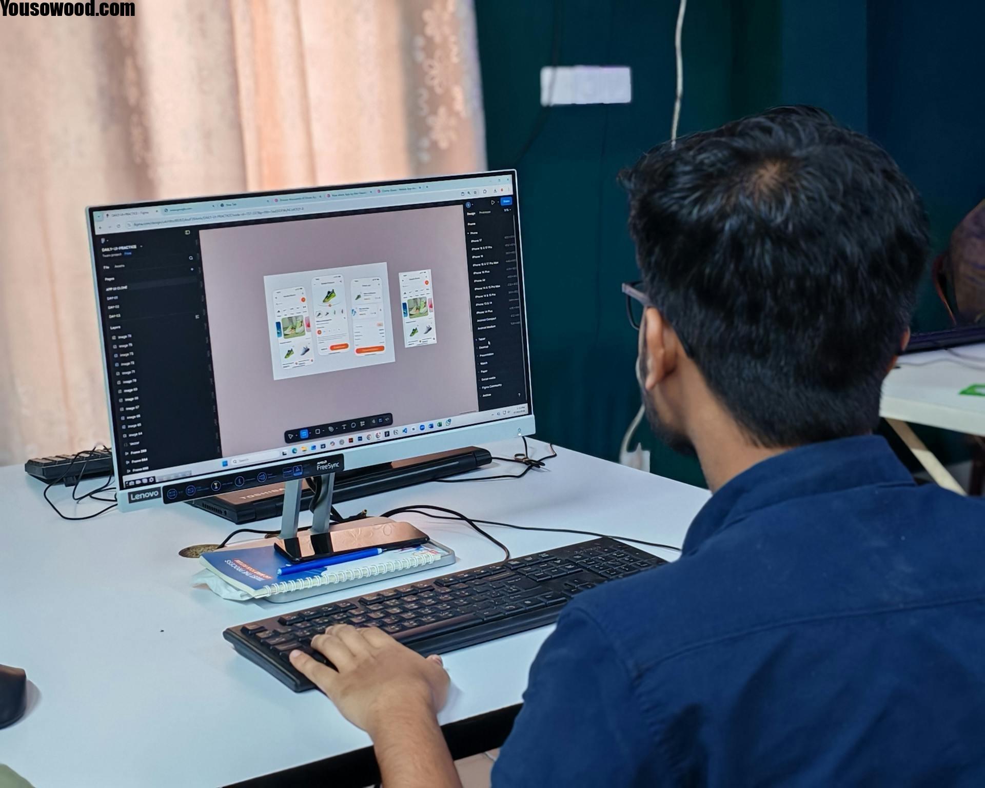
5. Let Tools Do the Heavy Lifting
You don’t need to be a developer or designer to build something polished anymore. Modern tools make it possible to create professional layouts using drag-and-drop systems and pre-built components. For brands operating in technical or industrial spaces, platforms like an industrial no code UI builder allow teams to create clean, functional interfaces without writing a single line of code. The key is choosing tools that balance flexibility with guardrails so your site stays consistent and brand-aligned as it grows.
6. Consistency Turns “Nice” Into “Professional”
Consistency is one of the strongest signals of quality design. That means consistent typography, button styles, spacing, color usage, and tone of voice across the entire site. Inconsistent details—slightly different colors, mismatched icons, uneven spacing—are often subtle, but they chip away at trust. Beginners should create simple style rules early and stick to them religiously. When everything feels cohesive, the site feels intentional rather than assembled piece by piece.
7. Beauty Must Support Action
A beautiful site that doesn’t convert is just digital art. Every design choice should ultimately support business objectives—sign-ups, inquiries, demos, purchases, or education. Clear calls to action, readable content, and accessible navigation ensure that visual appeal doesn’t come at the cost of usability. Beauty and function are not opposites; they’re partners. The most effective sites feel good to look at and easy to use.
Bonus Tip: Build for Iteration, Not Perfection
Beginners often get stuck trying to make everything perfect before launch. The reality is that great sites evolve. Launch with a strong foundation, gather feedback, watch how users interact, and refine over time. Iteration is where great design really takes shape. When your mindset shifts from “finished product” to “living asset,” the pressure drops and quality improves.
Why This Matters for Business
A beautiful site shapes how your brand is perceived long before a sales conversation ever happens. It signals competence, modernity, and care. For business audiences especially, design communicates seriousness and credibility faster than copy ever could. When your site looks intentional, people assume your operations, processes, and products are intentional too.
Conclusion
Building a beautiful site as a beginner isn’t about mastering design theory or learning to code—it’s about making clear, thoughtful choices that align with your brand and your goals. Focus on simplicity, consistency, flow, and function, and let modern tools support what you’re building. When beauty is rooted in clarity and purpose, your website becomes more than just a digital presence—it becomes a powerful extension of your brand.